


Website designs are not just one-size-fits-all. There are many different types of websites depending on purpose – but there are also different types of designs. Primarily, brands choose one of two: Adaptive web design or Responsive web design. But what’s the difference between the two?
In essence, both refer to designs that can change to look different across different devices. But how exactly do they achieve that? Read on to find out.
Why web design matters
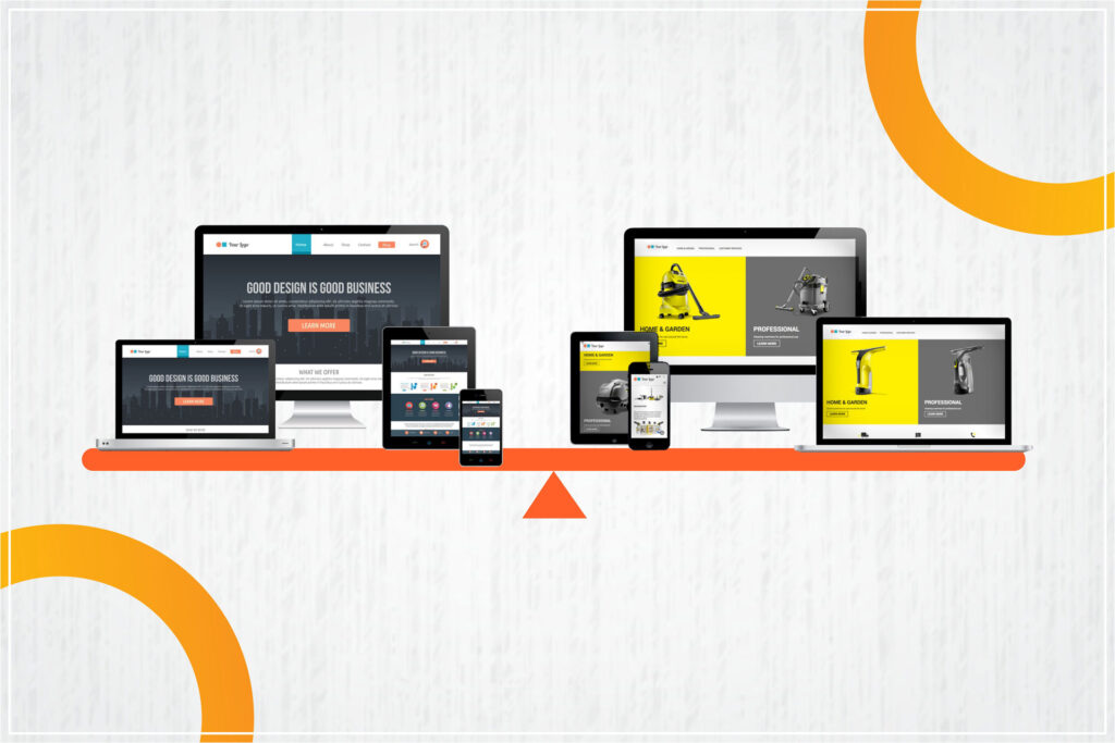
People use different devices to browse the web, from laptops to tablets, with smartphones being the most commonly used. Many of those devices have differently sized screens, on which website layouts look different.
Optimised user experience, which positively impacts the interactions users have with your website, could lead to more visits from users. Further, website visitors tend to stay longer on a website that functions well on their device, and will quickly leave if it doesn’t. Surveys show that nearly 75% of web developers believe that non-responsive designs are the #1 reason why customers leave a website.1
Basically, what kind of design you choose can decide the experience a user has with your website.
Optimising your website for different devices can be done in one of two ways, either using responsive design, or adaptive design. Both are focused on solving the same issue but do it in different ways.
It’s up to you which you want to eventually use since each one has its pros and cons. Let’s explore them in more detail now.
What is responsive web design?
Responsive web design is often described as creating a “fluid website”. In other words, the website looks the same no matter what device you access it from. This is also sometimes abbreviated to RWD (but usually only by developers).
However, a responsive design has codes that detect what kinds of device is being used to view it. Then, it changes its layout in a pre-set way to fit the size of the screen and its orientation.
This method uses a programming design language known as CSS (cascading style sheets). The details of the display and layout are written in CSS, and the website changes according to the device.
Using CSS means you only need to create one codebase for the site. However, you still need to account for design and content changes on different devices to optimise usability.
The difference in views on different screen sizes is created by adding breakpoints. A breakpoint is essentially the point at which a website’s design begins to shift, usually depending on the detected browser width.
Pros of responsive web design
- Developing a website using responsive web design takes less time. Obviously, this is because you only need to develop one code base.
- It’s also a little easier to maintain – again, because you only need to update one code base.
- But what about new screens with new sizes that didn’t exist a few years ago? Easy: responsive designs can easily be made adaptable to any new screen size by adding new breakpoints.
Cons of responsive web design
- Content may be lost or hidden on smaller devices as the website view shuffles.
- This kind of design has long been considered somewhat messy for websites that require a lot of user interaction. This is because some functionality can be hard to preserve on different sizes.
In simple terms, responsive web design is more suited for websites that carry a lot of content that doesn’t require a large number of complex user interactions.
What is adaptive web design?
Adaptive web design (AWD) also helps developers address the issue of how the website will look on different screen sizes. However, in AWD, the solution is achieved by creating a different website layout for each device, based on the given screen size.
In other words, the website code recognises the screen size on the device being used, and then offers a layout that is made for that specific size.
There are six common screen sizes: 320px, 480px, 760px, 960px, 1200px, and 1600px (where px stands for ‘pixels’). Many website developers choose to develop a different adaptive layout for all of them.
As you can imagine, this is often time-consuming. Some developers instead prefer a shortcut.
They collect user information for your website and determine the three most commonly used screen sizes. Once that information is obtained, they simply create website versions for each of them. This helps them to accommodate the majority of your users.
Pros of adaptive web design
- The website developer has great control of the design and layout of each version
- The layout, content, and user experience of every version can be perfectly optimised
- Adaptive design can also be easier to develop in terms of code, which accounts for each version individually, rather than try to adapt to all of them like RWD.
- Loads faster than RWD sites
- Can be optimised for different content and user intent
Cons of adaptive web design
- Can create a lot of labour-intensive work for the website developer
- Changing for a new screen size can require a whole new design to be built
- Creating different layouts can be quite complicated
Responsive or Adaptive? Which design is best?
Both of these methods have their pros and cons, so we cannot really say which one is the best. In truth, it all comes down to your preferences. What does your website deal with? How do you want users to view it and interact with it? Does it need to be customised for different kinds of users? Can it work with minimal design changes for different devices?
Also consider what you want your users to see when they open your website; placement of content, what you consider important on your website, and how to preserve the user experience you want to provide.
Based on your answers to these questions, you can then decide what kind of web design you need to go in for.
Better still, drop us a line and our expert web designers will be happy to help you figure out the best solution for you.
Liked this article? Make sure to check out our website and subscribe to our blog for more tricks and tips on content, SEO, and other topics to help your business.
References:
1. Hubspot, Web Design Stats for 2020
